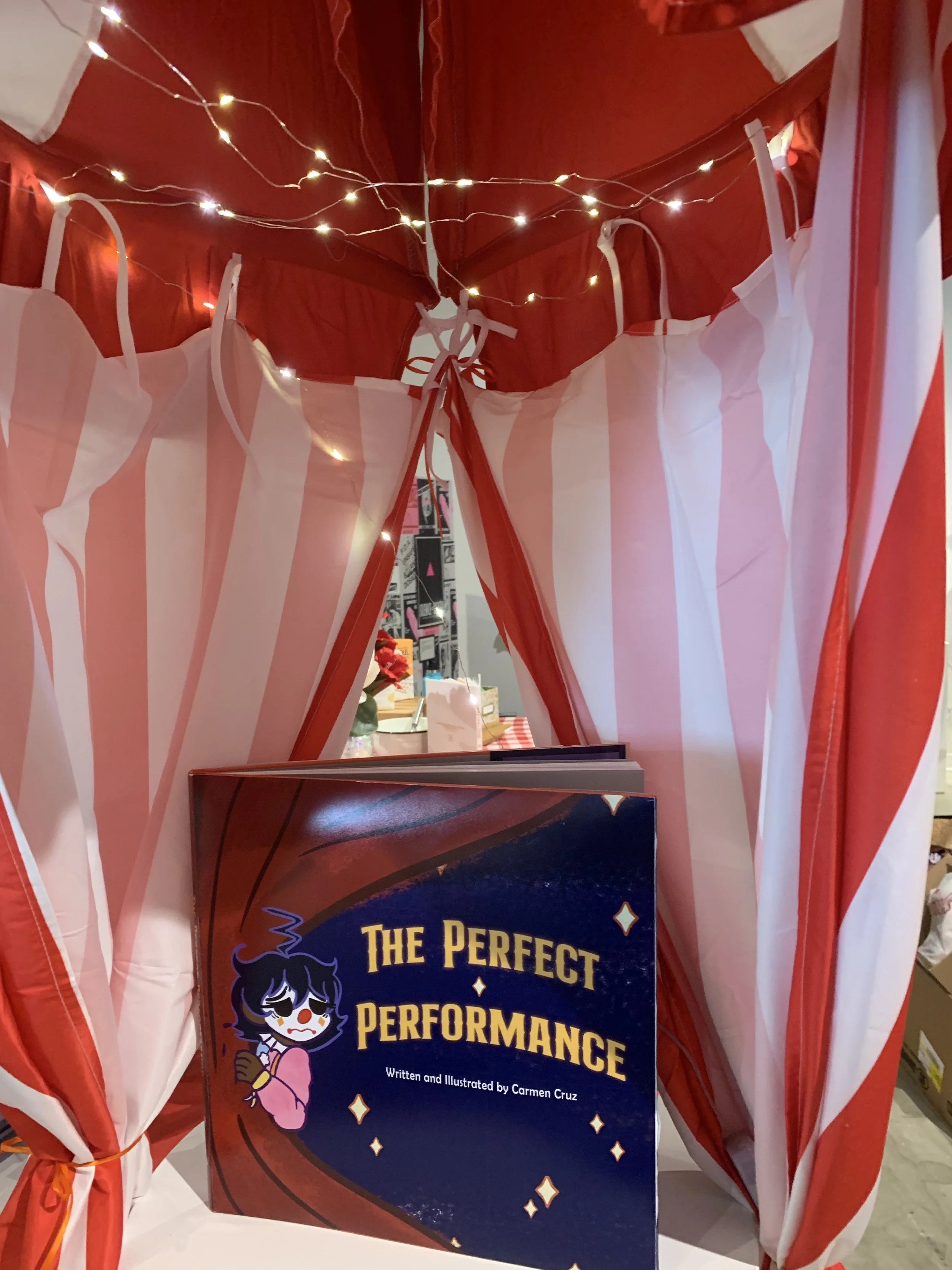
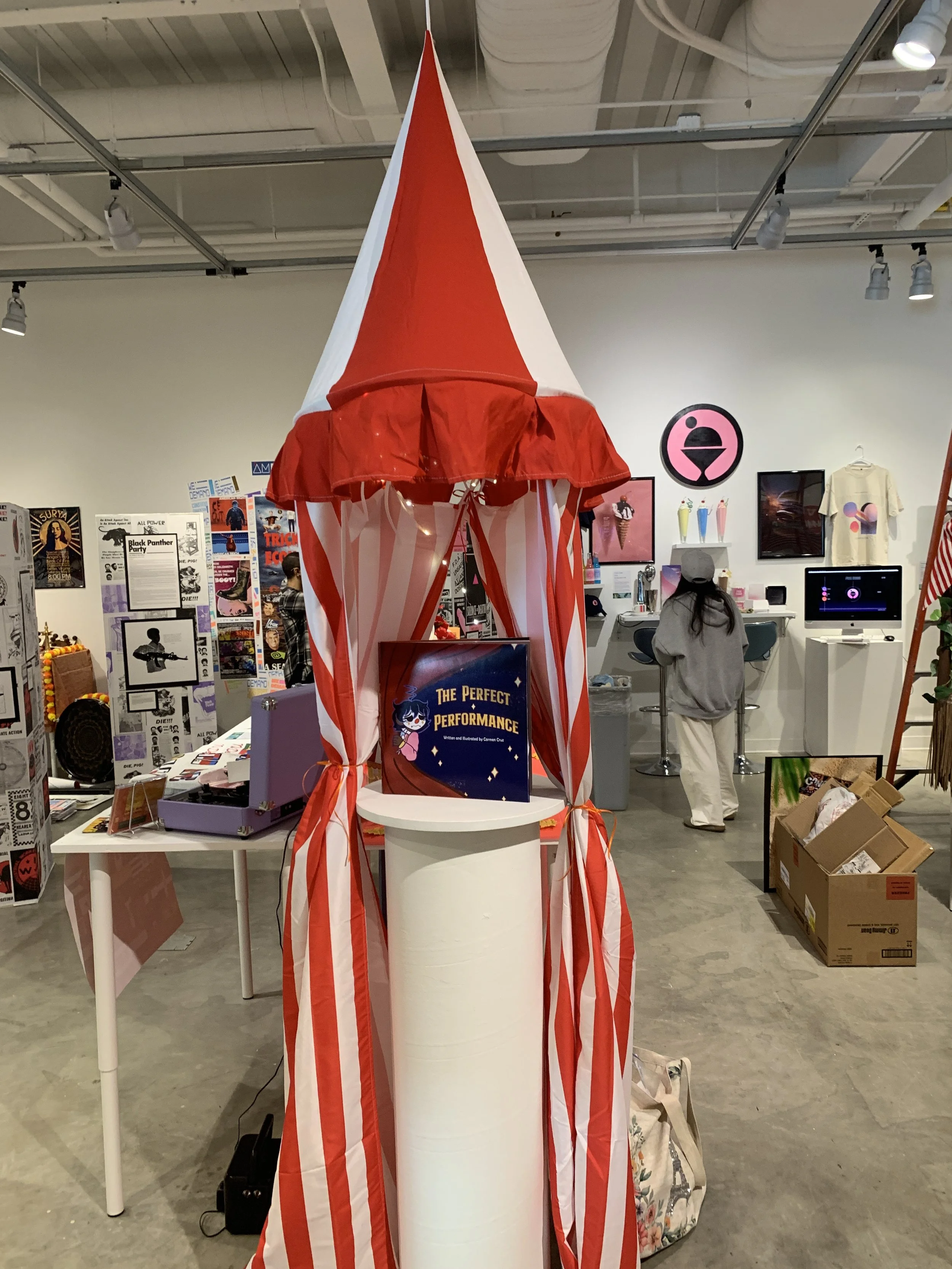
Perfect Performance
Publication Design
InDesign| Illustrator| Photoshop
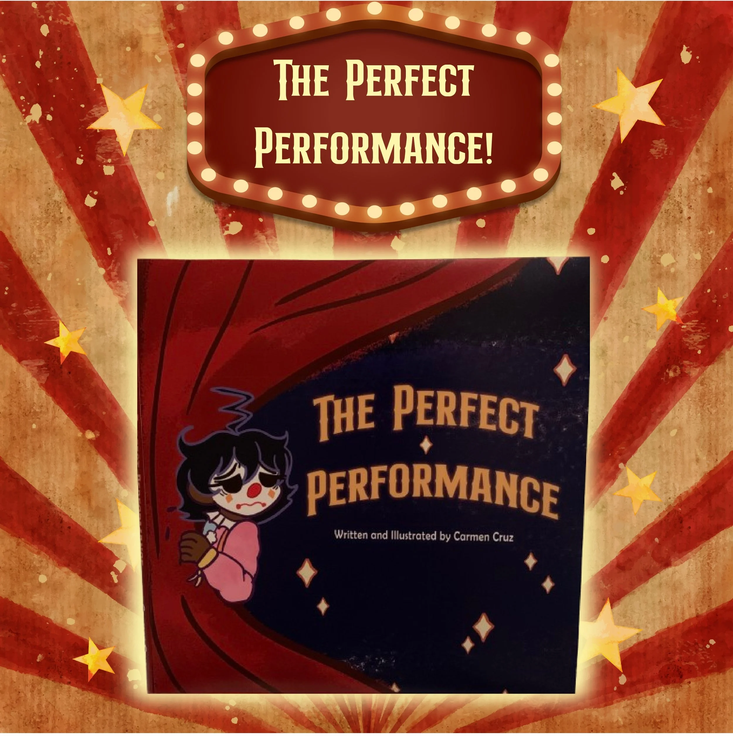
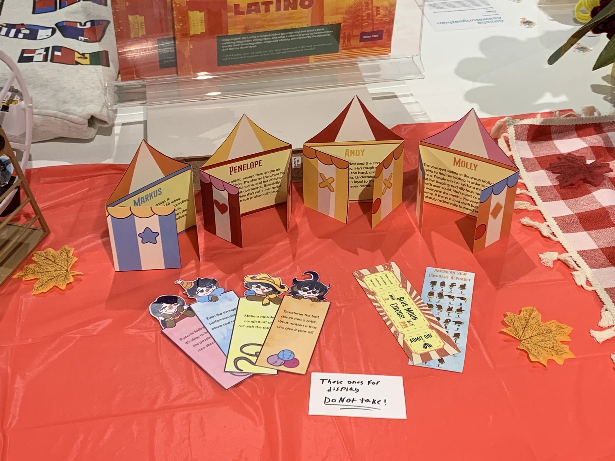
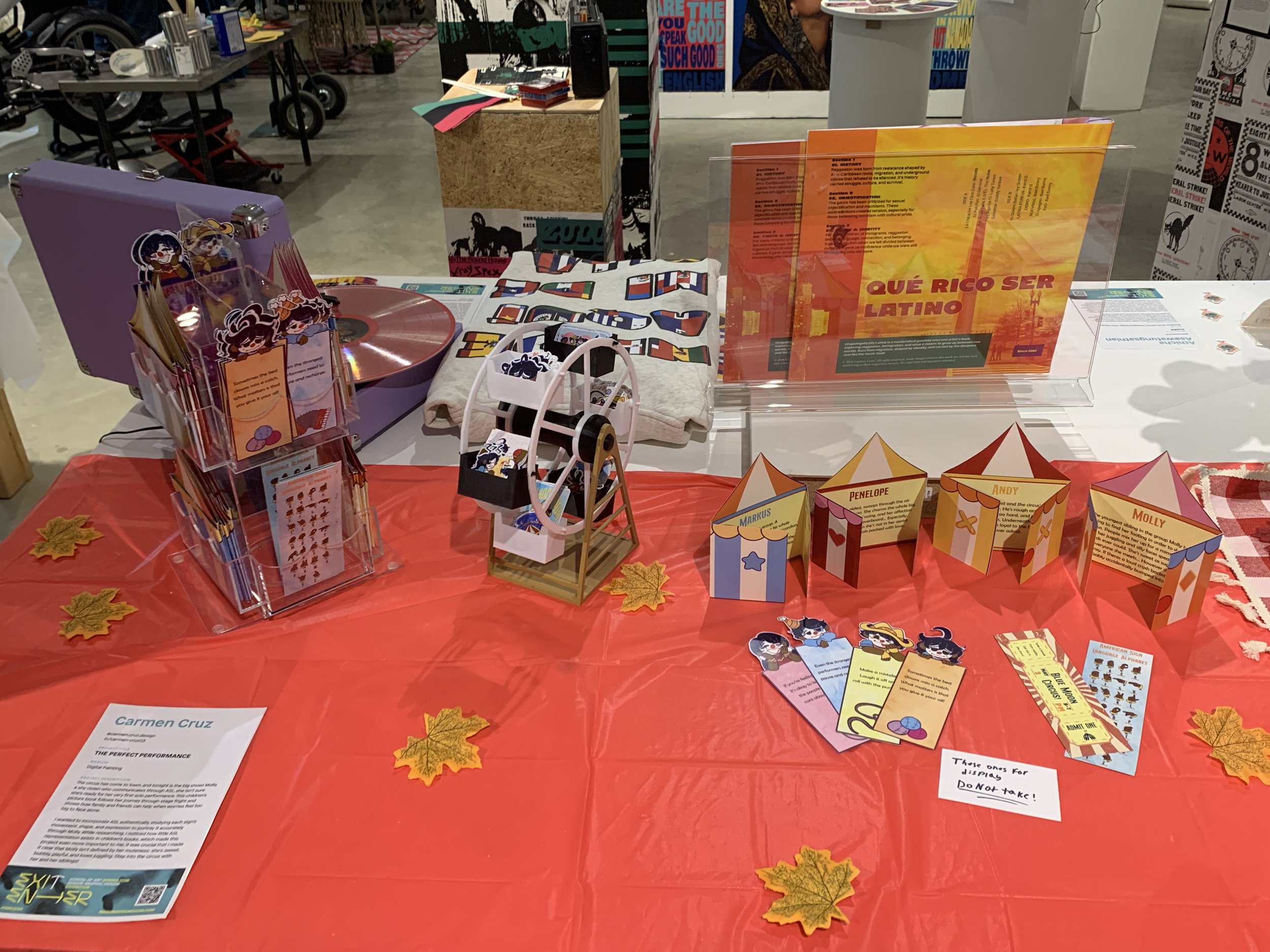
The circus has come to town, and tonight is the big show! Molly, a shy clown who communicates through ASL, She isn't sure she’s ready for her very first solo performance. This children’s picture book follows her journey through stage fright and shows how family and friends can help when worries feel too big to face alone.
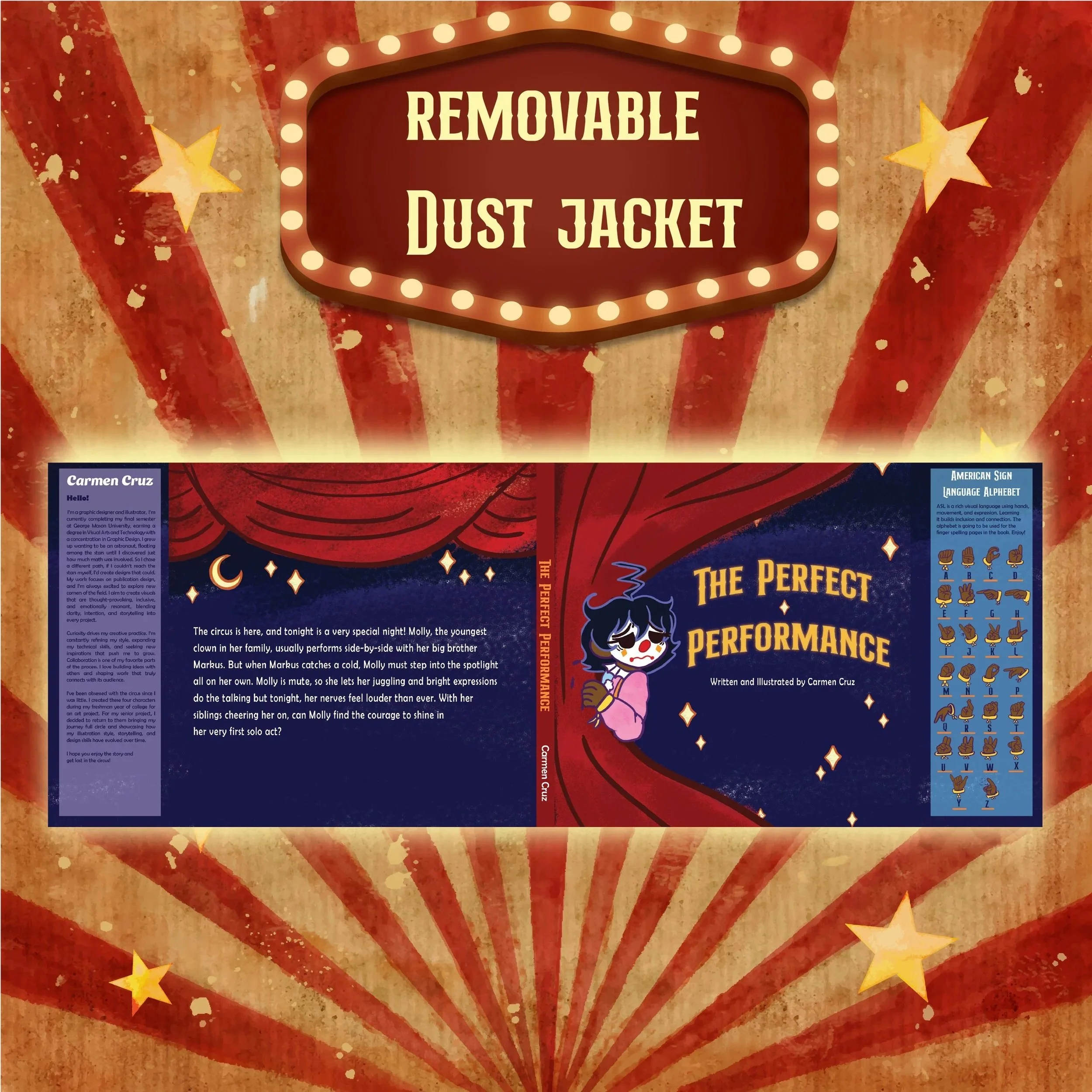
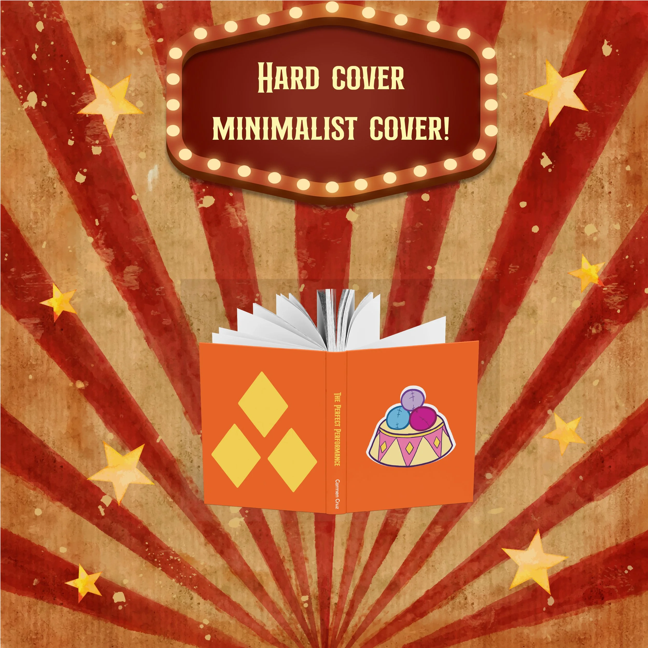
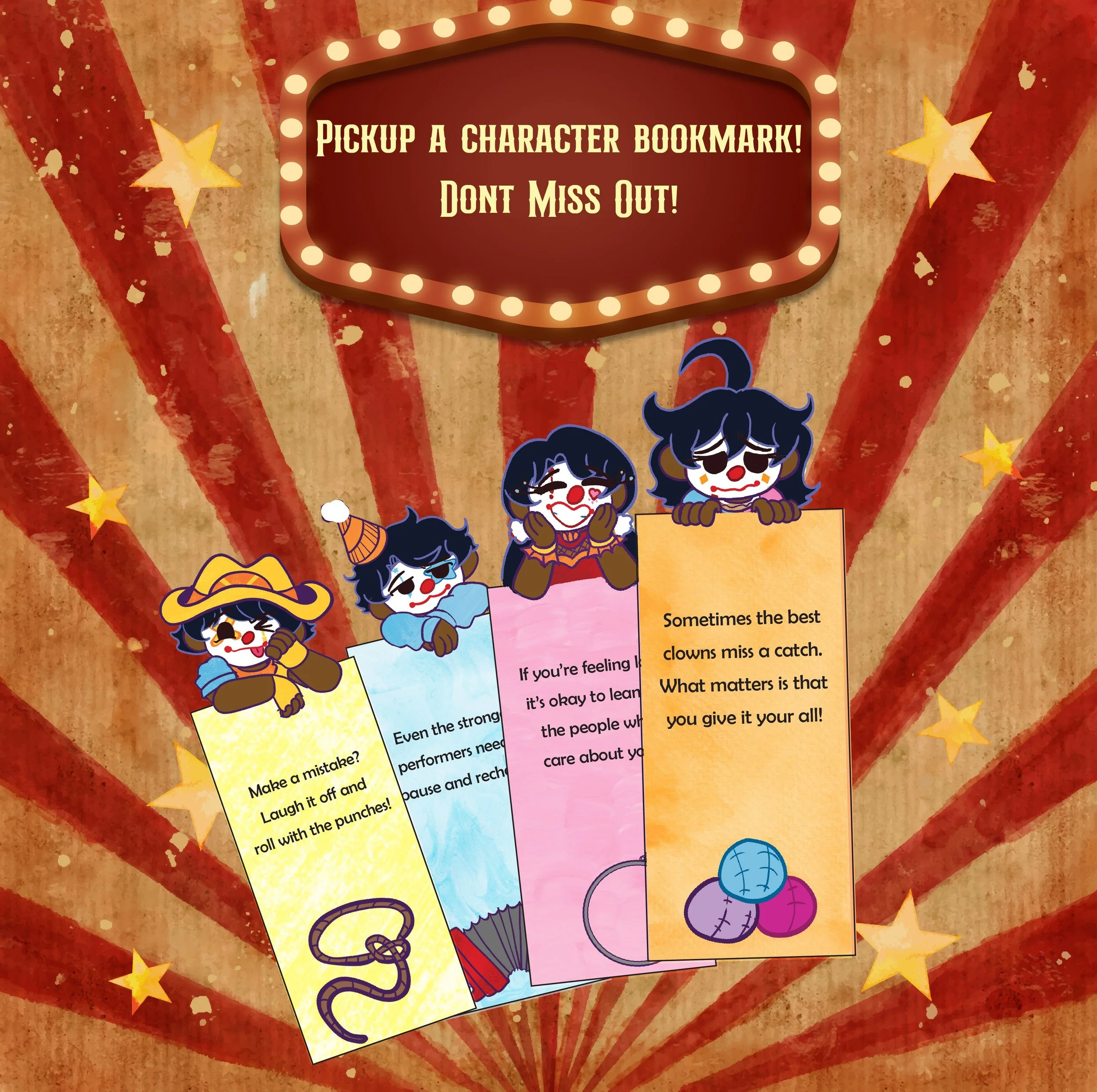
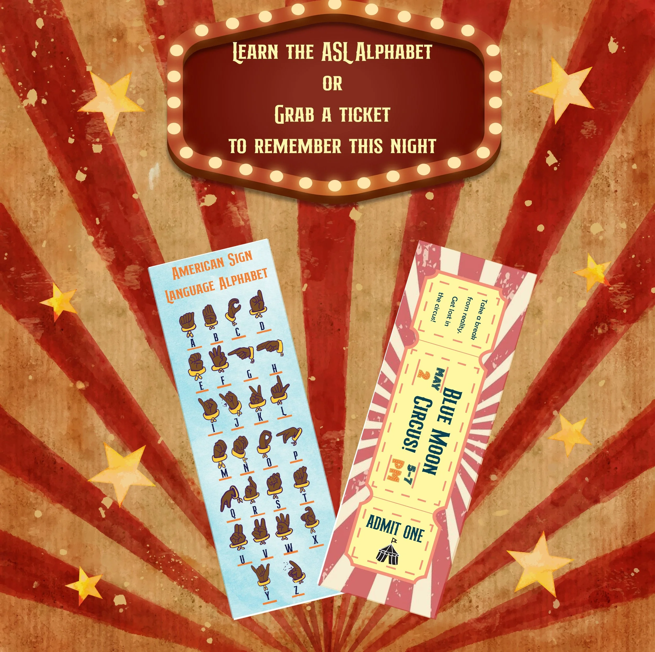
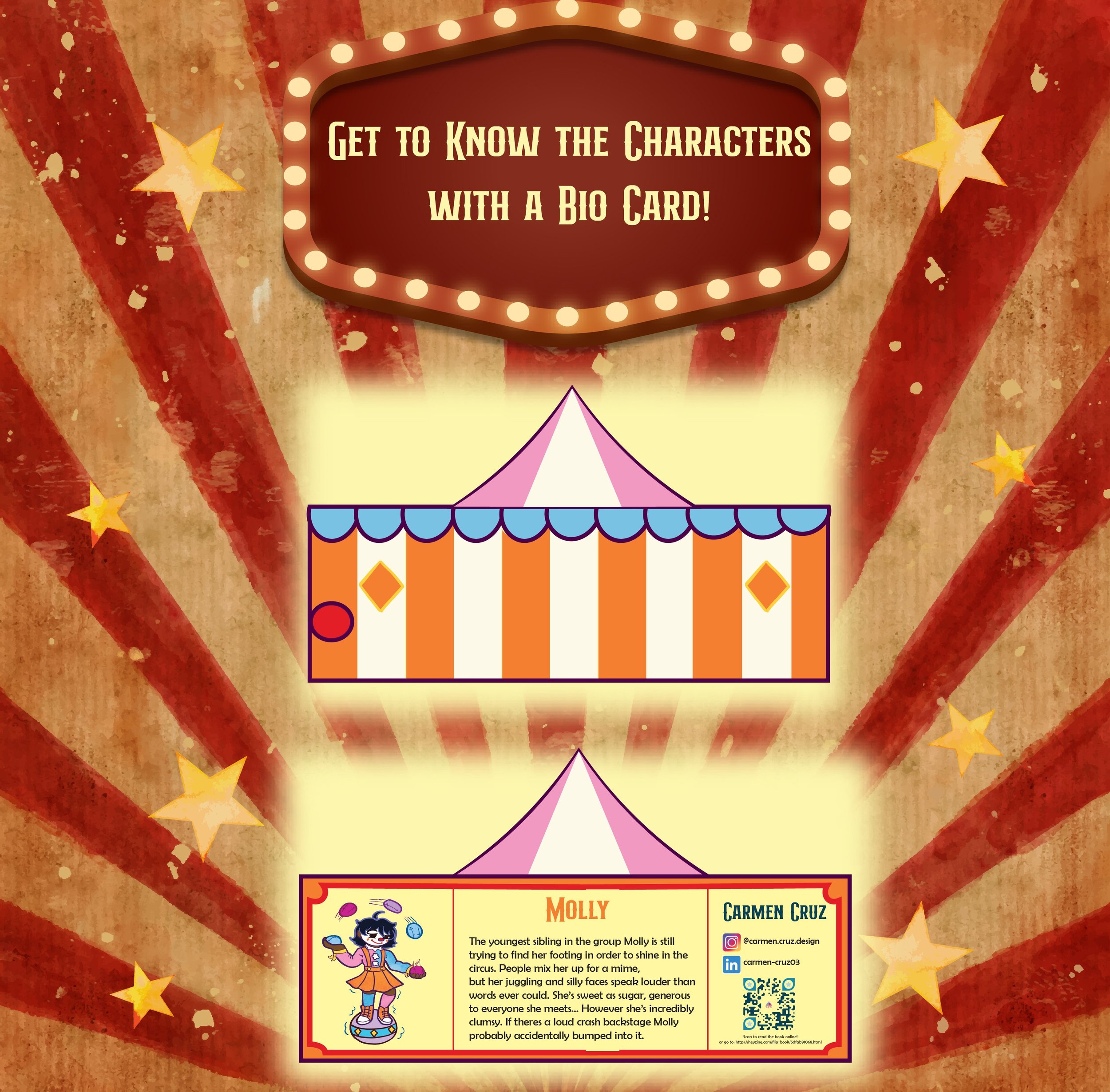
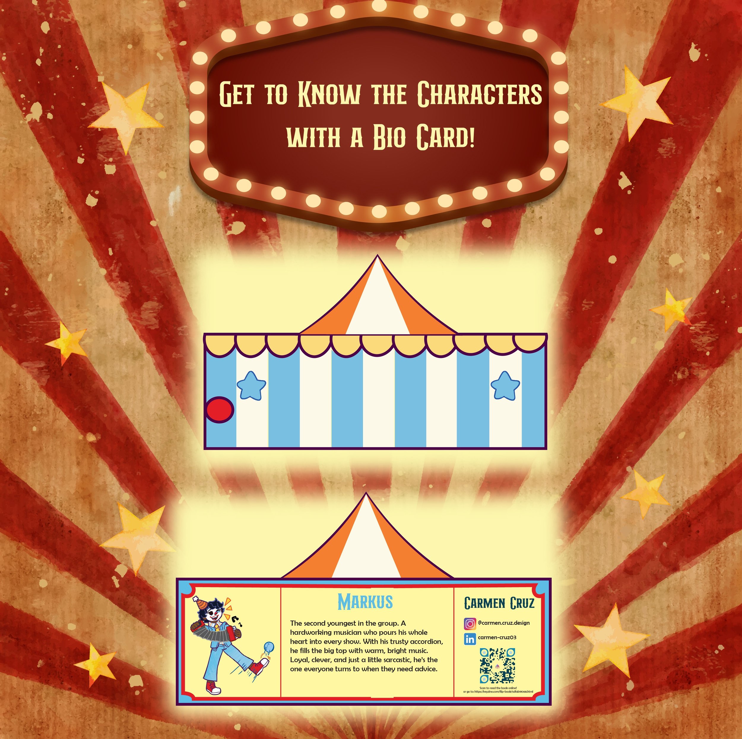
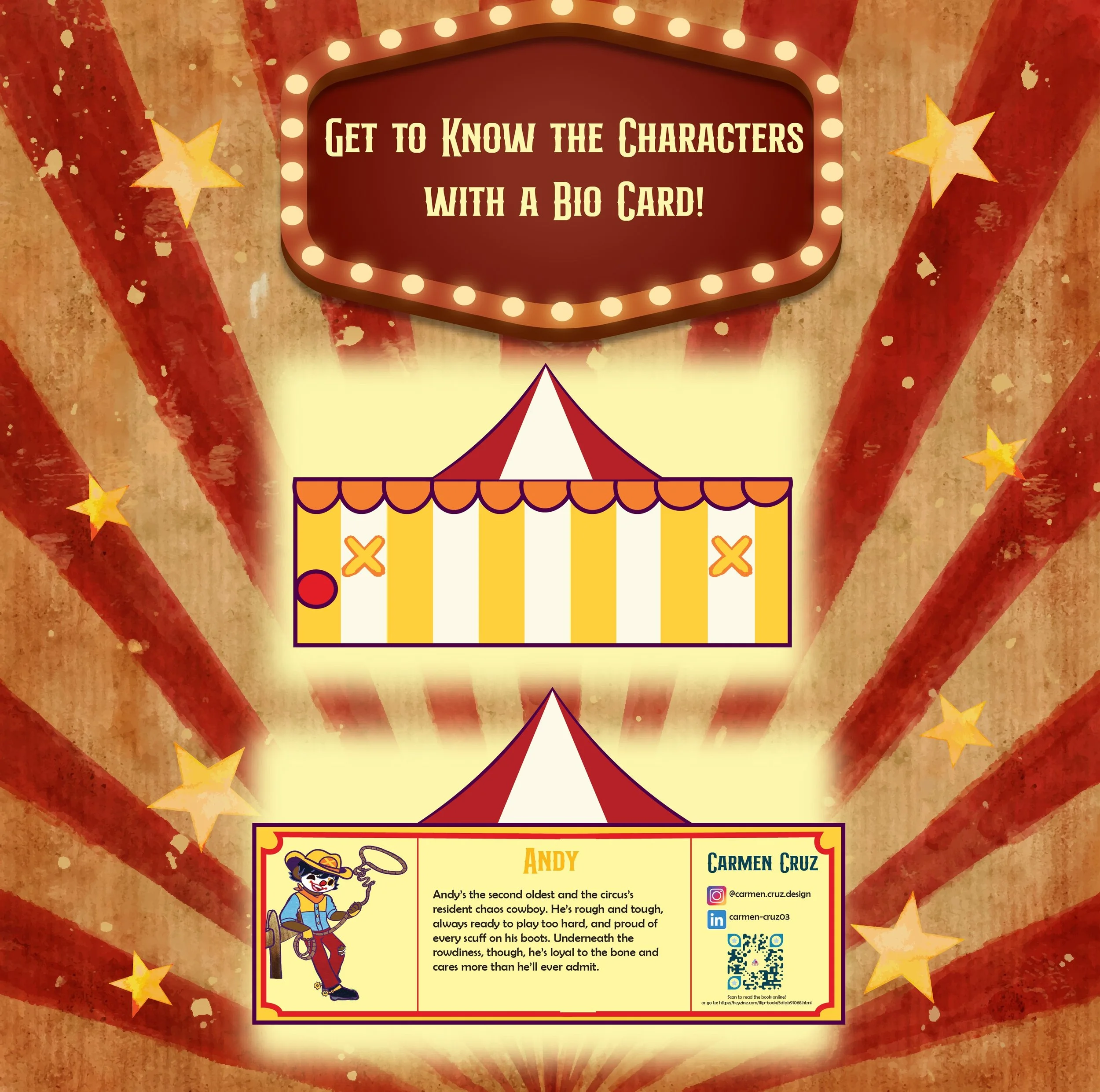
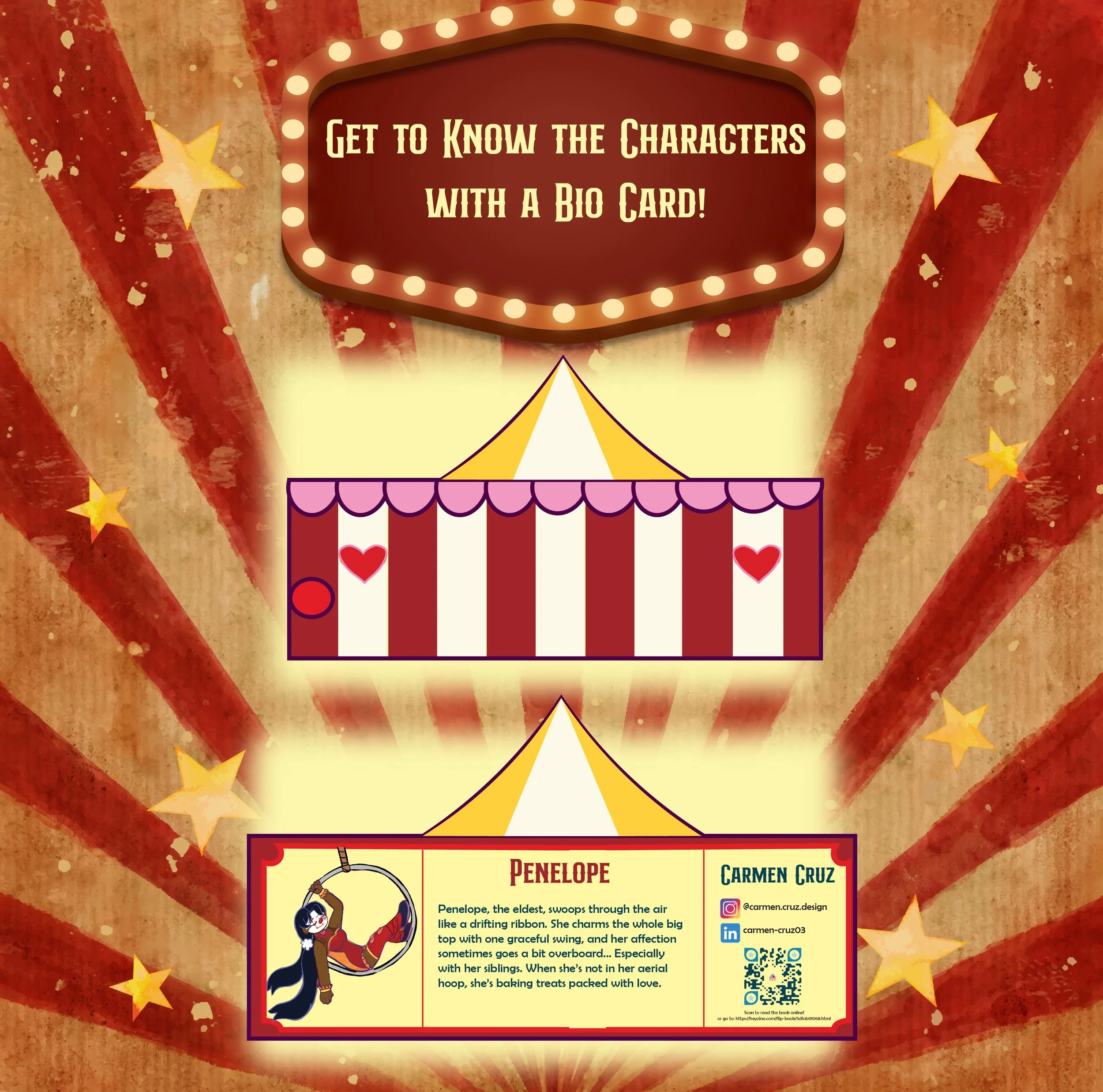
For my senior project at George Mason University, I spent the semester writing, designing, and illustrating a 12 × 12 in, 48‑page children’s book that incorporates ASL fingerspelling and signs. The final deliverables included the printed book (produced through Blurb with a removable dust jacket and minimalist hardcover), six bookmarks, four “meet the character” cards, and a set of stickers for guests at the senior show. All 120 giveaway items were taken by visitors during the exhibition.
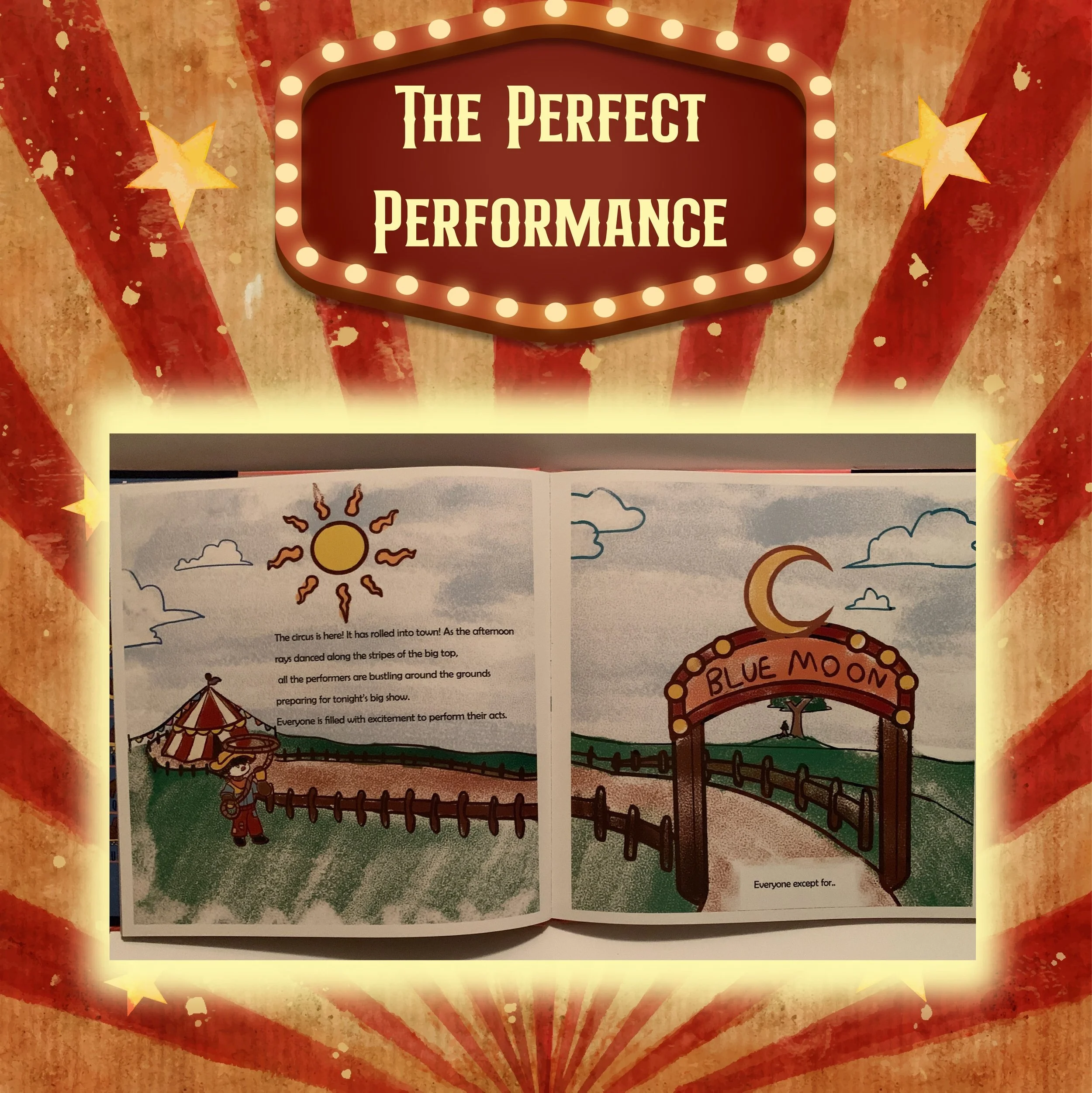
Creating the book required a significant learning curve. My early drafts were far too long because I assumed every spread needed a full‑bleed illustration. Through research and guidance from my professor. I learned that children’s books often use a mix of vignettes, spot illustrations, and full‑bleed scenes to control pacing, provide visual rest, and support storytelling. After six rounds of rewriting to refine the tone, rhythm, and page count, I moved into layout sketching and determined how the text would interact with the illustrations so it never felt secondary. It was important to me that the text didnt feel like an after thought so I decided to determine where to place it and have the illustrations incorporate around it or interact with the text directly. Once I have the layouts placed in InDesign I turned to Photoshop to start the drawing process.
Once the layouts were set in InDesign, I shifted to Photoshop for the illustration phase. I sketched every page, then organized the artwork by story section (Opening, Molly, Markus, Final Show, etc.) to maintain consistency in inking, color, and texture. I created 80 illustrations for the book itself, and had all ASL signs reviewed by an interpreter for accuracy. When the pages were finalized, I sent the files to Blurb for printing while I completed the remaining deliverables.
The dust jacket was designed in Illustrator on a 12.5 × 38 in canvas. The most challenging element was creating and arranging all 26 ASL alphabet illustrations within the narrow front‑flap space. Because some letters require different hand orientations, I experimented with multiple compositions before landing on a layout that was both clear and visually appealing.
The bookmarks and character cards were straightforward to design but difficult to print due to their irregular shapes and double‑sided alignment. Achieving clean, accurate cuts required multiple rounds of adjustments. Eight reprints for the bookmarks and six for the cards. Once perfected, the final pieces elevated the overall presentation of the project.
In total, I completed 113 illustrations across the book and its supporting materials. This project strengthened my skills in storytelling, illustration, typography, layout design, and production. It culminated in a polished, cohesive exhibit that showcased my growth as both a designer and illustrator. Along with having a showstopping exhibit that many guests stopped to visit and emptied all the deliverables that I set out which was 120 copies.