The AG Effect
Brand Design
InDesign| Illustrator| Photoshop
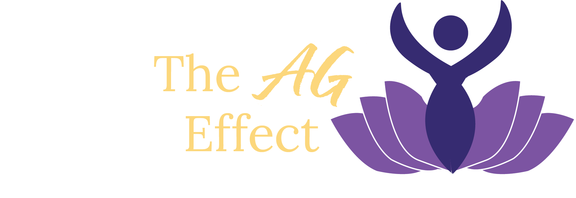
This freelancing project involved collaborating with a newly launched executive coaching company serving corporate and government clients. When I joined, the brand had no established visual identity, so I began by having an in depth conversation with the owner to understand the company’s values, goals, and the sense of trust they wanted to convey to their clients. From there, I created a mood board and initial sketches, one of which being a figure blooming from a lotus which strongly resonated with the client.
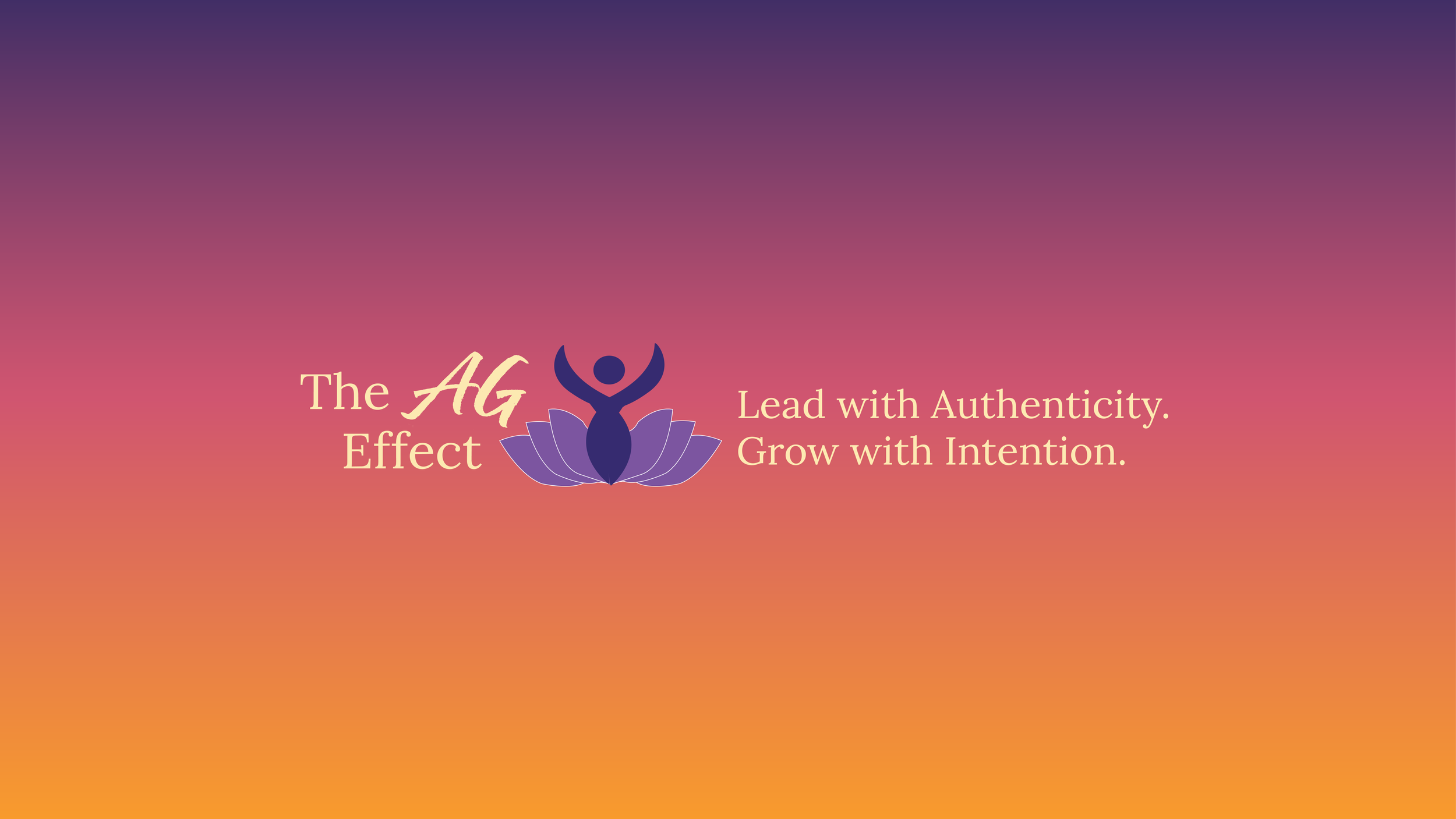
I then developed the full illustration in Illustrator and worked with the owner to establish a color palette. Although the client was insistent on using a pastel yellow for the typography, I explained the readability issues it would create on a white background and their webpage. Ultimately, we compromised on a deeper gold, and I included a secondary burnt‑orange text option in the brand guide. In addition to the logo system and brand guide, I also created the company’s YouTube, LinkedIn, and Instagram banners.
The final result was a cohesive visual identity that the company continues to use, even as they work with new designers. This project strengthened my ability to advocate for design decisions while also respecting client preferences.